
This article will explore the principles behind asymmetrical layouts, the benefits of using them, and practical steps for implementing this design style on your website. By the end, you’ll not only understand why asymmetry is a powerful tool in web design but also how to harness its potential to create unique, effective, and visually appealing sites.
1. Understanding Asymmetry in Web Design
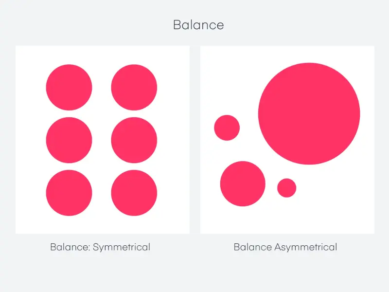
At its core, asymmetry refers to the lack of a mirrored or equally balanced arrangement of elements. Traditional web layouts often rely on symmetrical designs—where elements are arranged equally on either side of a central axis—to create balance and order. In contrast, asymmetrical layouts deliberately disrupt this balance, using uneven spacing, unique shapes, or varying sizes of elements to create a more visually compelling design.
Why Choose Asymmetry?
-
Visual Interest: Symmetrical layouts can sometimes feel predictable, even dull. Asymmetry, on the other hand, creates visual tension that keeps users engaged and curious.
-
Creative Freedom: Asymmetry allows designers to break free from rigid structures, enabling more creativity and the opportunity to design beyond the confines of grids and templates.
-
User Attention: Asymmetrical designs can guide the viewer’s eye more strategically. By creating intentional imbalance, designers can emphasize particular elements of the page, subtly leading users through the content in a curated flow.
-
Aesthetic Appeal: Asymmetry can lend an organic, artistic feel to a website. This can be especially beneficial for creative portfolios, artistic brands, or websites aiming for a modern, cutting-edge aesthetic.
2. The Psychological Impact of Asymmetrical Layouts
Before diving into how you can implement asymmetry in your web design, it’s important to understand the psychology behind this technique. Human beings naturally seek balance and harmony, which is why symmetrical designs are often perceived as visually pleasing and calming. However, asymmetry introduces an element of surprise, which can be psychologically stimulating.
Key Psychological Factors:
-
Tension: Asymmetrical designs create a form of visual tension that grabs attention. This tension can evoke curiosity, making users more likely to explore the page to understand the layout.
-
Movement: Asymmetrical layouts often imply a sense of movement or flow. Elements that are arranged in a non-uniform manner can lead the user’s eye across the page in an intentional way, helping guide their experience without overt directional cues like arrows.
-
Engagement: The unexpected nature of asymmetry makes it more engaging. A user might spend more time interacting with the site simply because it feels different and exciting compared to the more familiar symmetrical layouts.
3. Principles of Asymmetrical Layouts
While asymmetry can introduce disorder, it’s important to remember that successful asymmetrical designs still require thoughtful planning. Simply placing elements randomly on a page doesn’t achieve the desired effect; in fact, that would likely result in a confusing or frustrating user experience. Instead, asymmetry should be used in a way that balances aesthetic appeal with functionality.
Principle 1: Balance Without Symmetry
Balance is still crucial in asymmetrical design. Even though the elements are not mirror images, the design should still feel cohesive. You can achieve balance by considering:
-
Visual Weight: Some elements naturally carry more visual weight due to size, color, or complexity. For instance, a large, bold header on one side of the page can be balanced by a collection of smaller, lighter elements on the other.
-
Negative Space: The use of empty (negative) space is key in asymmetry. Rather than filling every inch of the screen with content, consider leaving certain areas empty to contrast against more populated sections.
-
Color and Contrast: Strong color contrasts or bold typography can be used to create focus and direct user attention. Vivid colors on one side of the screen can offset more muted tones on the other side.
Principle 2: Focal Points
In asymmetrical layouts, it’s essential to identify key focal points that guide the user’s attention. This can be achieved through:
-
Hierarchy of Elements: Not all elements on the page are of equal importance. Larger, more prominent elements, like headers or images, should take center stage, while less critical information, like footnotes or captions, can be positioned in a way that doesn’t compete for attention.
-
Strategic Use of Imagery: Large, eye-catching images can serve as natural focal points in asymmetrical layouts. Pair these with smaller, text-based elements to create a visual balance without a traditional grid.
Principle 3: Grid Systems with Flexibility
While asymmetrical layouts are designed to defy the typical grid, many effective asymmetrical designs still work within an underlying grid system. However, instead of adhering strictly to its rules, they play with variations in column width, height, and spacing. This approach gives structure to the chaos, ensuring the page remains navigable and user-friendly.
4. How to Implement Asymmetry on Your Website
Now that we’ve covered the principles of asymmetry, let’s get into the practical side of how to implement it on your site.
Step 1: Choose the Right Framework
While asymmetry is often about breaking free from rigid frameworks, most web designers still start with some form of structure. Using flexible frameworks like CSS Grid or Flexbox will allow you to position elements dynamically without being locked into a strictly symmetrical grid.
-
CSS Grid: This tool is perfect for creating irregular layouts because it allows you to design grid systems that can adapt to various screen sizes, enabling you to combine wide, narrow, tall, and short columns seamlessly.
-
Flexbox: Use Flexbox to align items along horizontal or vertical lines. It offers the flexibility to place items at any distance from each other, helping you create that asymmetrical look without losing structure.
Step 2: Start with a Simple Layout
If you’re new to asymmetrical design, start simple. Try splitting the page into sections, then experiment with varying the sizes and positions of elements in each section. For instance, you could use:
- A large image on the left side with a small block of text to the right.
- Uneven column widths, where one column is twice the size of the other.
- Skewed or diagonal alignments that break the horizontal-vertical axis without sacrificing readability.
Step 3: Use Overlapping Elements
One technique that’s commonly used in asymmetrical layouts is overlapping elements. This creates depth and interest without requiring perfect symmetry. For example:
- Place an image partially over a block of text or another image.
- Use transparent backgrounds or shadows to enhance the effect of overlapping.
This technique works well in both static designs and interactive web pages where hovering over an element can change its placement.
Step 4: Leverage Negative Space
Negative space, or white space, is one of the most effective tools in an asymmetrical layout. By leaving areas of the page intentionally empty, you can draw attention to key elements without crowding the layout.
- Avoid filling every space with content.
- Use larger margins on one side of the page to emphasize the asymmetry.
- Create breathing room around focal elements to help them stand out.
Step 5: Play with Typography
Typography can play a major role in asymmetrical layouts. Try experimenting with:
-
Large fonts: Use oversized fonts for headers, juxtaposed against much smaller body text.
-
Varying weights and styles: Mix different font weights, sizes, and colors in your headings and subheadings to create contrast and draw attention.
-
Non-linear placement: Instead of placing text in standard horizontal lines, try angling text or placing it vertically.
Step 6: Use Color to Define Areas
Color can be a powerful tool for achieving balance in an asymmetrical layout. Bold, vibrant colors can be used to highlight certain areas, while muted tones can fade into the background.
- Contrast: Strong color contrast can help balance a heavy design on one side of the page with lighter, more subtle elements on the other.
- Gradients: Use gradients to create a visual flow between different areas of the layout, enhancing the sense of movement within the design.
5. Best Practices for Asymmetrical Layouts
When designing an asymmetrical layout, keep these best practices in mind to ensure your design is both beautiful and functional:
-
Mobile Responsiveness: Always design with mobile in mind. Asymmetrical designs can be harder to translate to smaller screens, so ensure your elements are responsive and maintain balance on different devices.
-
Test for Usability: A good design is one that enhances usability. Ensure that your asymmetrical design doesn’t confuse users or make the navigation experience cumbersome.
-
Avoid Overcomplication: While asymmetry can be exciting, too much can overwhelm users. Simplicity is key—focus on guiding the user’s attention with subtle variations in the layout, rather than going for shock value.
-
Accessibility Considerations: Ensure that your design is accessible to all users, including those with visual impairments. Use high contrast for text, make sure buttons are easily clickable, and provide text alternatives for non-text content.
6. Examples of Asymmetrical Layouts in the Wild
Here are a few examples of brands that have successfully implemented asymmetry in their web designs:
-
Spotify: Spotify’s homepage frequently features asymmetrical designs, with bold text and large images that guide the user’s attention without relying on a traditional grid.
-
Apple: Apple often uses large product images with smaller text blocks, creating an asymmetrical design that emphasizes the beauty of their products while maintaining a clean, user-friendly experience.
-
Awwwards: Many of the sites featured on Awwwards, a platform that highlights innovative web design, incorporate asymmetrical layouts to great effect. These designs often use overlapping elements, varying column widths, and strategic negative space to keep users engaged.
Asymmetrical layouts in web design are a powerful tool for creating visually engaging, dynamic websites that break free from the rigidity of traditional grids. By strategically using imbalance, negative space, and visual hierarchy, you can guide users through your content in a way that feels fresh, creative, and unique.
As you begin to implement asymmetry on your own site, remember that it’s not about abandoning structure altogether—rather, it’s about finding the perfect balance between creativity and usability. When done right, asymmetry can transform your web design into a work of art that stands out from the crowd while still delivering a seamless, user-friendly experience.
By following the steps and principles outlined in this article, you’ll be well on your way to mastering the art of asymmetrical layouts.


